Bespoke brand pages on Asda.com for major FMCG suppliers. I designed and built pages for brands without their own design resource, consulted with brands that had one, and built the templates and training that let the wider team produce them too.
£100K investment secured from Cadbury for a Branded Zone
Overview
Asda sold two tiers of bespoke brand page to suppliers: Simple Branded Zones, a single page with a top module, and Complex Branded Zones, with multiple pages and full customisation. Each one had to meet the supplier's brand goals while still feeling like part of Asda.com.
My Role
Design, front-end build, supplier collaboration and design consultancy, plus code templates and training for the designers on my team.
Client
Asda.com
Partners
LEGO, Cadbury, Coca-Cola and more
Format
Simple & Complex Branded Zones
Scope
Design to front-end build
Bespoke Design · Build
Designing for Suppliers
Many suppliers didn't have the design resource to create a page themselves, so I designed it for them. That started with understanding each brand's identity, goals and audience, then creating bespoke wireframes and designs before building the page on Asda.com.
Every page was built to be responsive and accessible, with alt text on all images and mobile navigation patterns that worked across screen sizes and browsers.
Information Architecture · User Flows · Commercial UX
Asda Pets: Redesigning a Category Takeover
The pet category on Asda.com had been sold to suppliers as a permanent takeover. Historically, the Sales team sold it as a fixed piece of media, with a "skin": a background that took over the whole category. It made the category look different from every other part of Asda.com, and it raised questions about how category takeovers should work in the future.
A permanent fixture wasn't the right approach for shoppers or for the business. I redesigned the takeover as something modular that brands could buy into, that felt cohesive with the rest of the site, and that helped the user journey instead of simply taking over the page.
Because the takeover sat on category pages the merchandising team owned, the redesign had to work with them, balancing funded content from brands with helping shoppers find the right product for their pet.
Shoppers
Need to get to the right food or treats for their pet quickly, without wading through advertising.
The merchandising team
Own the category pages and product ranges, so the hub had to keep products easy to find and work within their structure.
Brands
Pay for visibility. Instead of one permanent takeover, they needed clearly defined slots they could choose to buy into.
The redesign changed three things. Brands bought into modular slots instead of a permanent fixture. The pages matched the rest of Asda.com instead of carrying a full-category skin. And navigation came first, with funded slots below it, instead of the takeover coming first.
Mapping the journey
I mapped how shoppers would move from the existing category page into the hub, and from there either straight to a category or through a brand. Funded placements sit along the journey as alternative routes to products, rather than as obstacles in front of them.
User flow from a Criteo banner on the Pet Food category page, through the Asda Pets category hub, to individual brand pages. Pink dashed routes are funded placements.
Options at different levels of supplier involvement
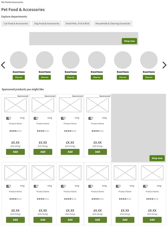
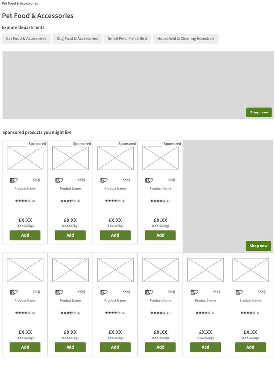
I presented three stripped-back versions, each built from modular slots, at different levels of supplier involvement. At one end, sponsored slots are added to the existing category page with minimal input from suppliers. At the other, a full Asda Pets hub, with or without navigation buttons, needs more supplier content.
Minimal supplier contentMore supplier content
Option 1
Sponsored category page
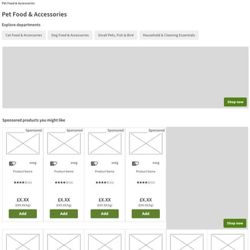
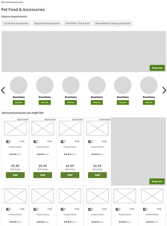
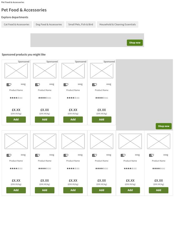
The existing taxonomy page stays as it is, with sponsored slots added: a billboard or leaderboard, brand pods, a promo banner and sponsored product inserts. The quickest to set up, with the least asked of suppliers.
Agreed option
Hub with navigation buttons
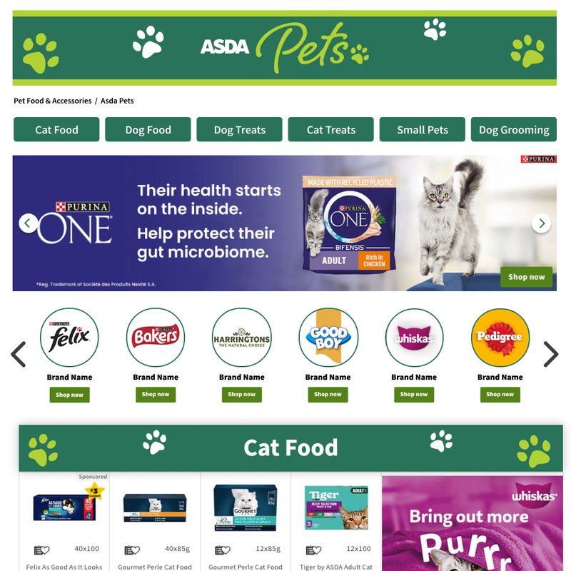
A dedicated Asda Pets hub. Category buttons jump down the page to a section for each category, each with its own promo banners, so shoppers can still go straight to what they need.
Option 3
Hub without navigation buttons
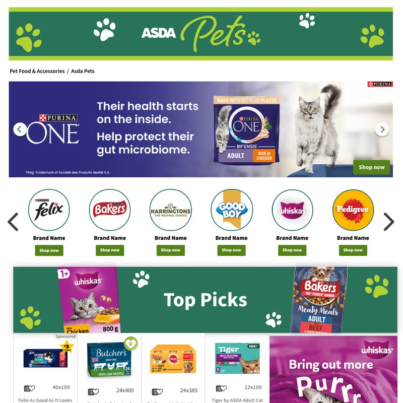
The same hub without the category buttons, built around a single Top Picks spotlight. More of the page is given to funded content, but there's no quick route to a specific category.
Considering sponsored opportunities
For the stripped-back option, I considered where sponsored opportunities could sit on the existing category page without changing its structure. I mapped four combinations of slots, so the team could see how much could be sold while the page still worked for shoppers.
Considering sponsored opportunities: four slot combinations for the existing category page, in desktop wireframes.
Agreeing the balance
I pitched the options to senior stakeholders in the merchandising team. They brought their own insight into which merchandising performed better, and together we worked through how much supplier content the hub should carry.
We reached a compromise that worked for both sides. Funded placements stayed, but not at the expense of the user journey: shoppers came first, and supplier content was limited so it didn't get in the way of finding the right product.
Merchandising insight
What the merchandising team knew performed better on their pages.
Supplier involvement
How much funded content the hub could carry.
User first
Nothing should get in the way of shoppers finding what they need.
Agreed
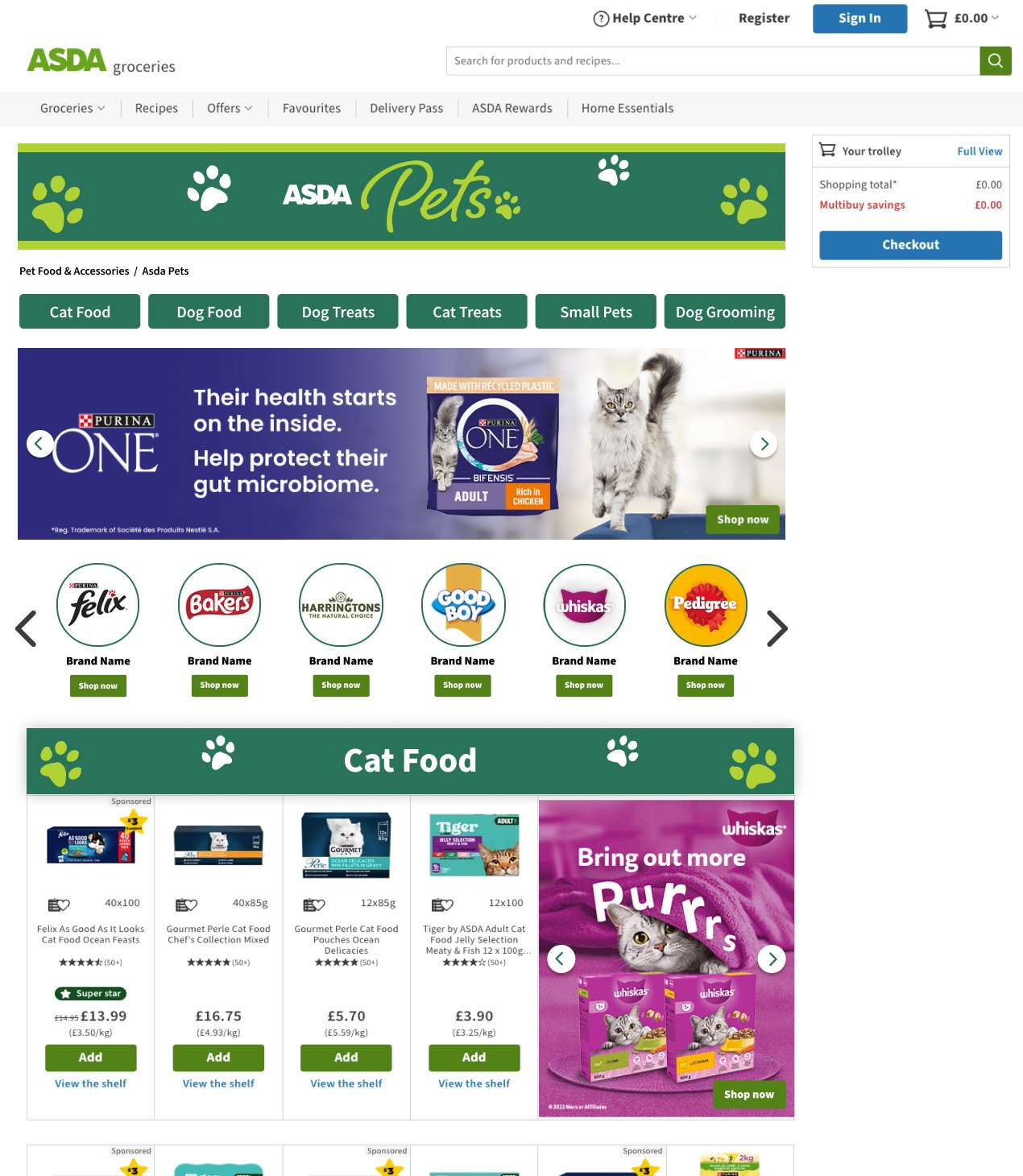
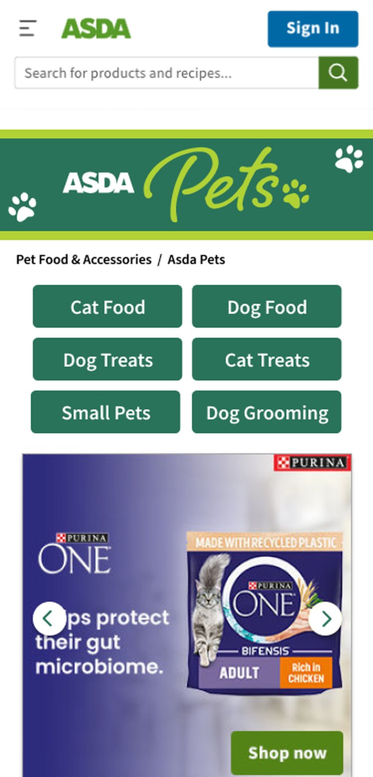
The Asda Pets hub with navigation buttons, with funded slots placed below the navigation.
Anatomy of the category hub
The final layout puts navigation first, with funded placements defined as clear, sellable slots further down.
123456
NavigationFundedBoth
1
Asda Pets headerA simple banner in Asda's own style, replacing the full-page skin so the category feels part of the site.
2
Category linksSimplified categories that jump down the page, so shoppers can go straight to what they need.
3
BillboardA sponsored hero carousel.
4
Brand iconsSponsored links to each brand's page.
5
Product spotlightA section for each category, mixing the range with sponsored product placements.
6
Promo bannersUp to four sponsored banners per category.
On mobileThe category buttons become a two-column grid at the top, so navigation still comes before any funded content.
Brand pages
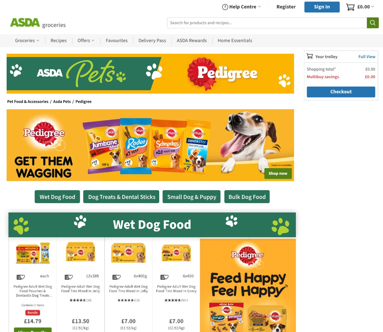
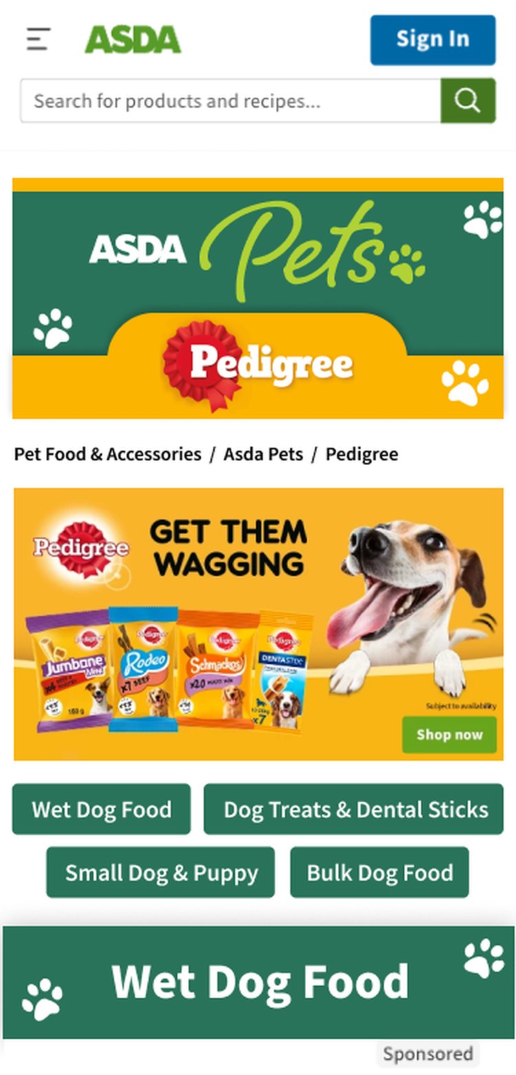
Each brand icon on the category hub leads to an individual brand page that sits inside Asda Pets. The header is created from the supplier's logo and chosen colour, so every page feels part of the same hub while still belonging to the brand.
Anchor links take shoppers to the brand's ranges, each with a product spotlight and promo banner. Carousels were offered as an optional upgrade, which gave brands a clear way to buy more visibility.
Featured · Campaign Alignment
LEGO Christmas Branded Zone
LEGO's Branded Zone ran alongside Asda's own Christmas campaign, so it had to work for both. I balanced LEGO's holiday campaign visuals with Asda's Christmas look, so the page felt like LEGO while still sitting naturally within Asda.com at its busiest time of year.
"Nick was great to work with! He balanced the ASDA Christmas campaign visuals and LEGO Holiday campaign visuals perfectly. Nick delivered an incredible digital activation, and I hope to work with him again soon."
Jonathan McRobb-BishopAssociate Trade Marketing Manager, The LEGO Group UK/I.
Featured · Design Consultancy
Cadbury Branded Zone & Competition
For brands with their own design teams, I acted as a design consultant. I created wireframes, developed customisable templates and guided their teams through building pages that met Asda's standards while achieving their own goals.
With Cadbury, that meant working closely with Mondelez to push what a Branded Zone could do, including a competition built into the page. The work helped secure a £100K investment from Cadbury.
"Highly recommend Nick. We worked together to develop and push the boundaries of what was possible in our Cadbury brand zone. Nick was creative, adaptive, agile and knowledgeable of what could be possible, which allowed us to deliver an exceptional brand page — industry leading."
Caroline BuchananE-commerce Customer Development Manager, Mondelez (Cadbury)
Templates · Training · Process
Scaling Up the Team
As demand grew, Branded Zones couldn't rely on me building every page. The design team grew from two to five designers, and I trained them on creating Branded Zones through training sessions.
To make that easier, I built up a repository of reusable code for complex Branded Zones. Designers could start from proven components instead of a blank page, which made training quicker and kept pages consistent. It also meant we could move fast when needed, including a fast-track Branded Zone delivered in two days.
£100K
investment secured from Cadbury
2 → 5
designers trained on Branded Zones as the team grew
2 days
to deliver a fast-track Branded Zone
Looking for the multi-brand seasonal hubs? Experiential Hubs has its own case study.