Taking LHA London's room bookings from a single generic form to a smart, filterable listing experience — cutting wasted enquiries for staff and frustration for applicants.
The Brief
LHA London is a charity providing affordable accommodation across 14 hostels in London. The brief was to overhaul the room discovery and booking flow to better serve both applicants and the LHA team.
My Role
End-to-end delivery: UX Research, UI Design, Wireframing, Custom WordPress Development (PHP & ACF), and system architecture.
Problem Statement
UX · Problem Discovery
The old website listed LHA's accommodations but gave users very little to go on — no live availability, no room-level detail, and no photos. It wasn't the intuitive, browsable experience people expect from modern accommodation platforms, and that disconnect was creating problems on both sides. Users were submitting enquiries for rooms they had little chance of getting, while the LHA team was overwhelmed with unqualified leads — particularly for high-demand rooms like singles. What LHA needed wasn't more enquiries, but better ones.
The previous site: no live availability, no room-level photography, and no filtering — leaving users with little to go on before submitting an enquiry.
Research & Discovery
Competitor Audit · UX Strategy
To understand the booking experience users were already familiar with, I audited how established accommodation platforms handle room discovery — particularly Booking.com and YHA, LHA's closest direct competitor. Both offered a browsable, filterable listing experience as standard — with live availability, room-level photography, and clear pricing upfront. It confirmed that LHA's generic enquiry form was a significant step behind user expectations, and gave me a solid reference point for the patterns and conventions worth bringing into the redesign.
Replicating those platforms directly, however, wasn't appropriate for how LHA operates. Stakeholder calls with the LHA team established that instant booking wasn't feasible — the business runs through a managed enquiry and vetting process, meaning the solution needed to work within that existing workflow. Those sessions also surfaced a key operational constraint: with only a small number of staff responsible for maintaining the site, any content management needed to be accessible enough for non-technical team members to handle independently, without relying on developer input for routine updates.
Design & Solution
System Architecture · UI Design
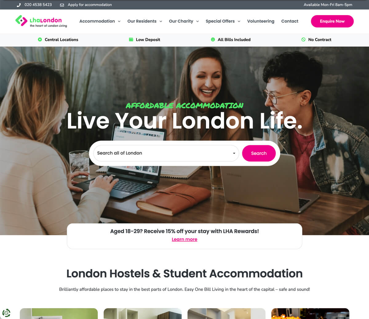
The journey was considered from the very first touchpoint. On the homepage hero, I added the ability to search by both location and room type — so users could arrive on the listings page with filters already applied, rather than starting from scratch. A small change, but one that meaningfully reduces the steps between intent and finding a suitable room.
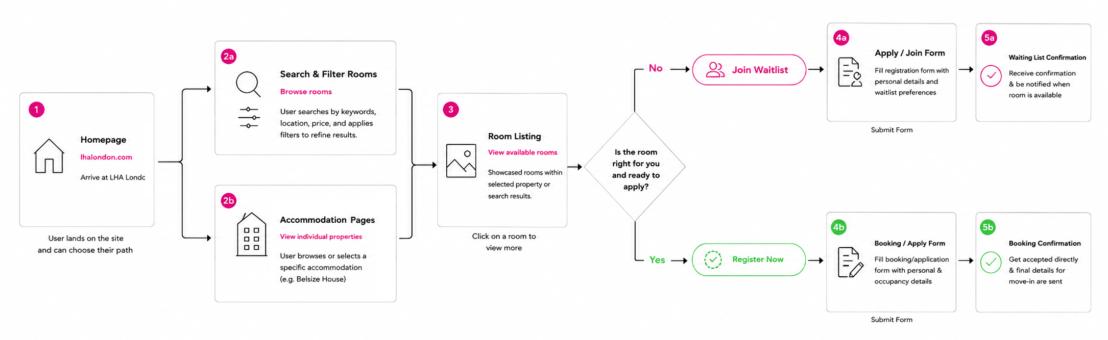
With the research pointing clearly toward a browsable listing experience, I mapped out the new user flow before touching any visuals. The key decision was how to handle availability — if a room was marked available, the user is routed to a Booking Form; if full, to a Waiting List Form. To reduce friction further, I built the system to pass URL parameters from the room card directly into the form, arriving with the Room Name, Hostel, and Room Type already pre-populated. The LHA team now receives clean, structured data with every submission rather than chasing missing information.
To avoid cutting users off entirely when a room is full, the system surfaces similar available rooms below the enquiry options — filtered by the same criteria the user had already selected. The goal was to keep applicants moving through the journey rather than reaching a dead end, particularly important given the high demand for certain room types.
Mapping the intelligent user flow: utilising URL parameters to auto-populate forms based on live room status.
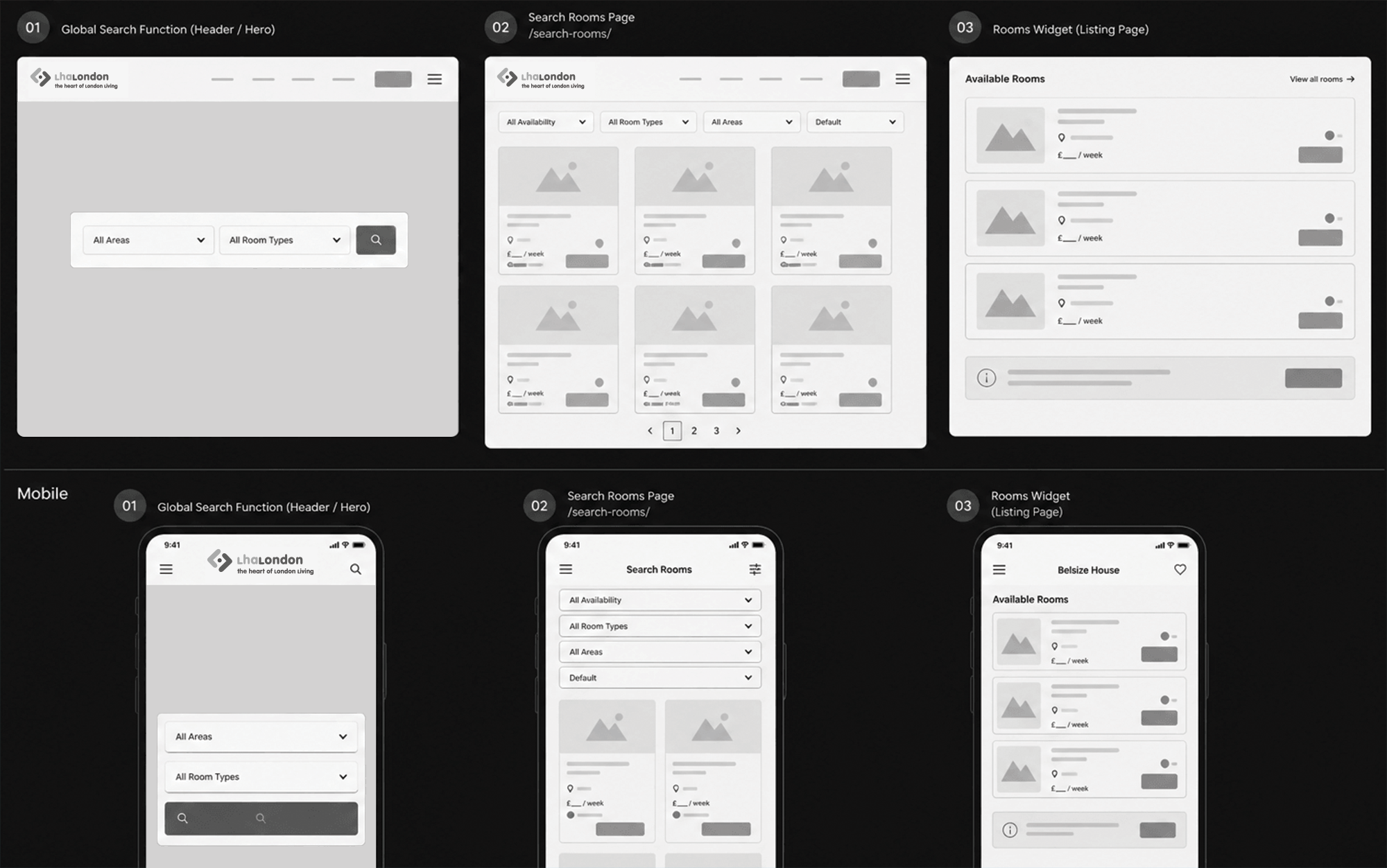
With the logic established, I moved into low-fidelity mockups to work out the room card format and overall layout — prioritising photos, price, room type, and a live availability badge, before presenting to the client for feedback.
Low fidelity mockups mapping out the new room cards and user interface layout.
Results
Development · Outcomes
To make the system scalable and self-sufficient, I custom-built an Advanced Custom Fields (ACF) backend interface in WordPress. The LHA team can now independently update pricing, toggle availability, and manage room inventory without ever needing to raise a developer request.
By surfacing availability upfront and routing users intelligently based on room status, the volume of mismatched enquiries dropped significantly. Every submission that does come through arrives structured and actionable — saving the team considerable administrative time and giving applicants a much clearer, more honest experience from the start.
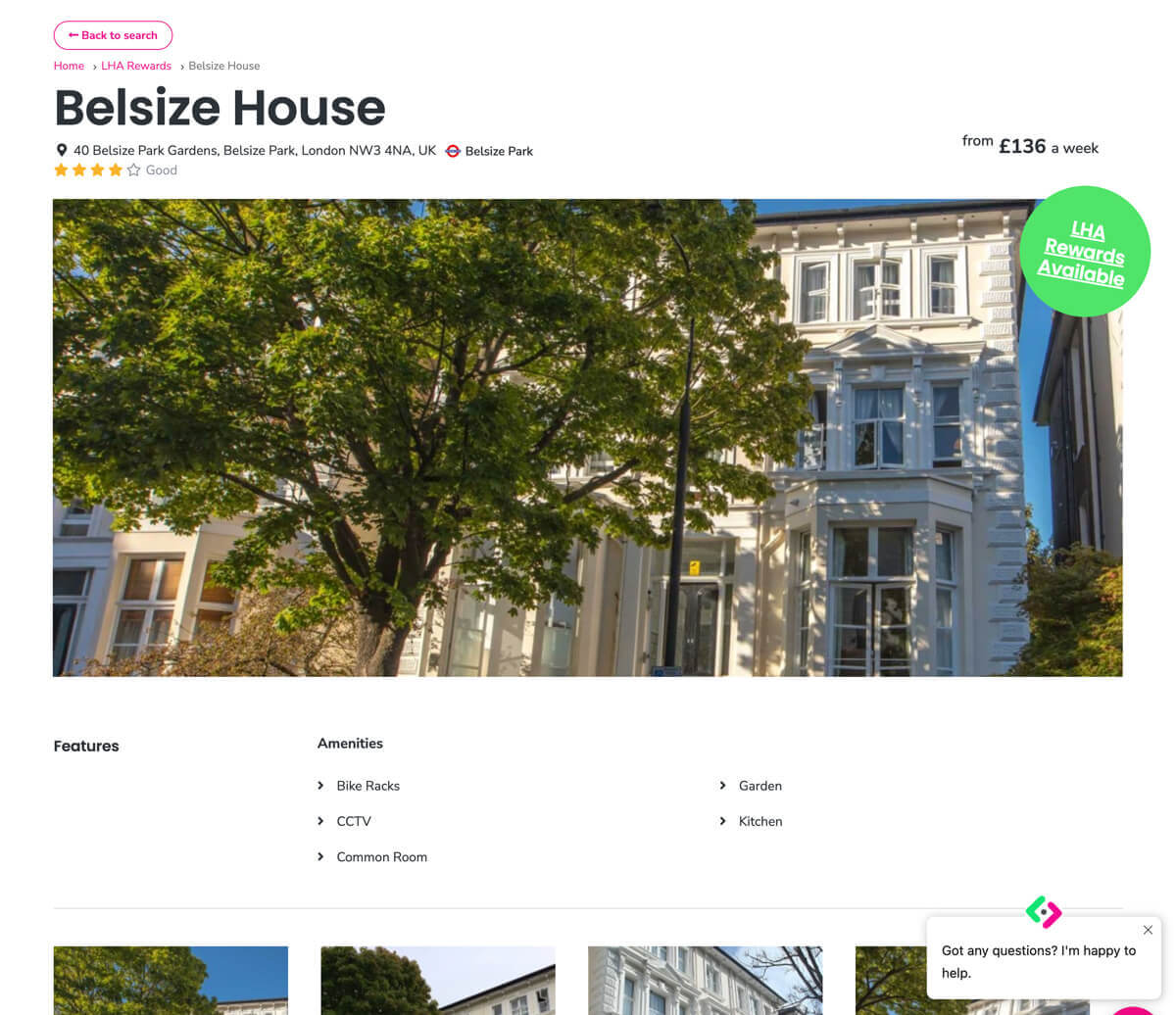
The redesigned room listings page — featuring live availability, room photography, and filtering by hostel, price, and room type.
The new additions to the website have significantly improved how guests navigate and access information. The structure is much clearer, making the booking journey more intuitive and user-friendly. We've already seen more confident user engagement and higher-quality enquiries. Internally, the updates have also made content much easier for our team to manage and maintain.
Aggie LeightonOperations Support Manager, LHA London