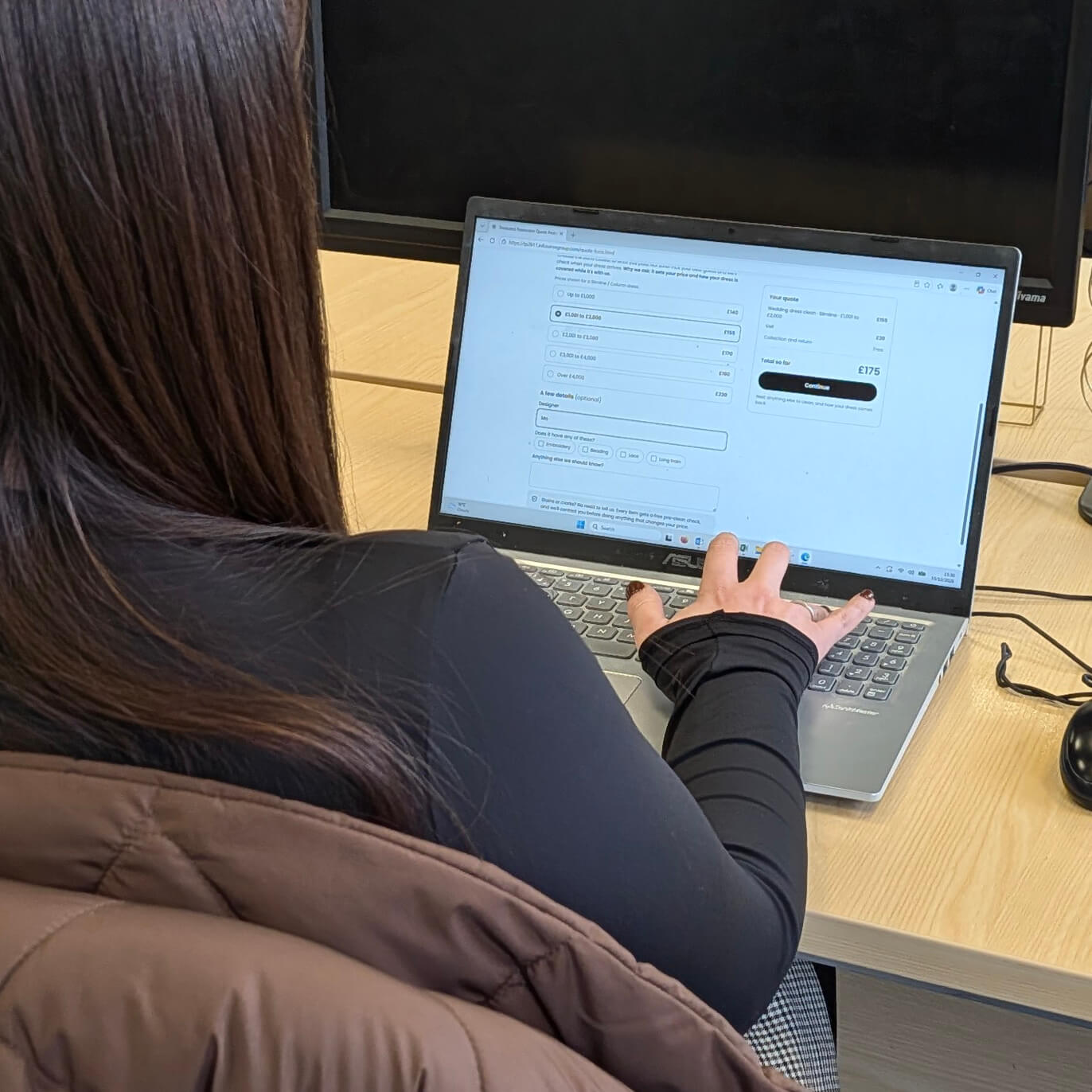
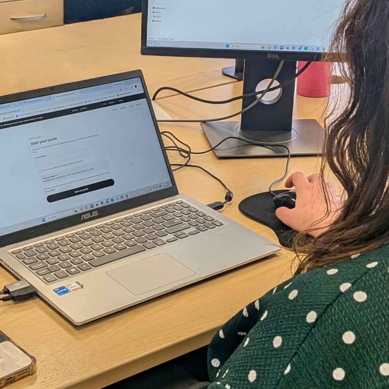
The Problem
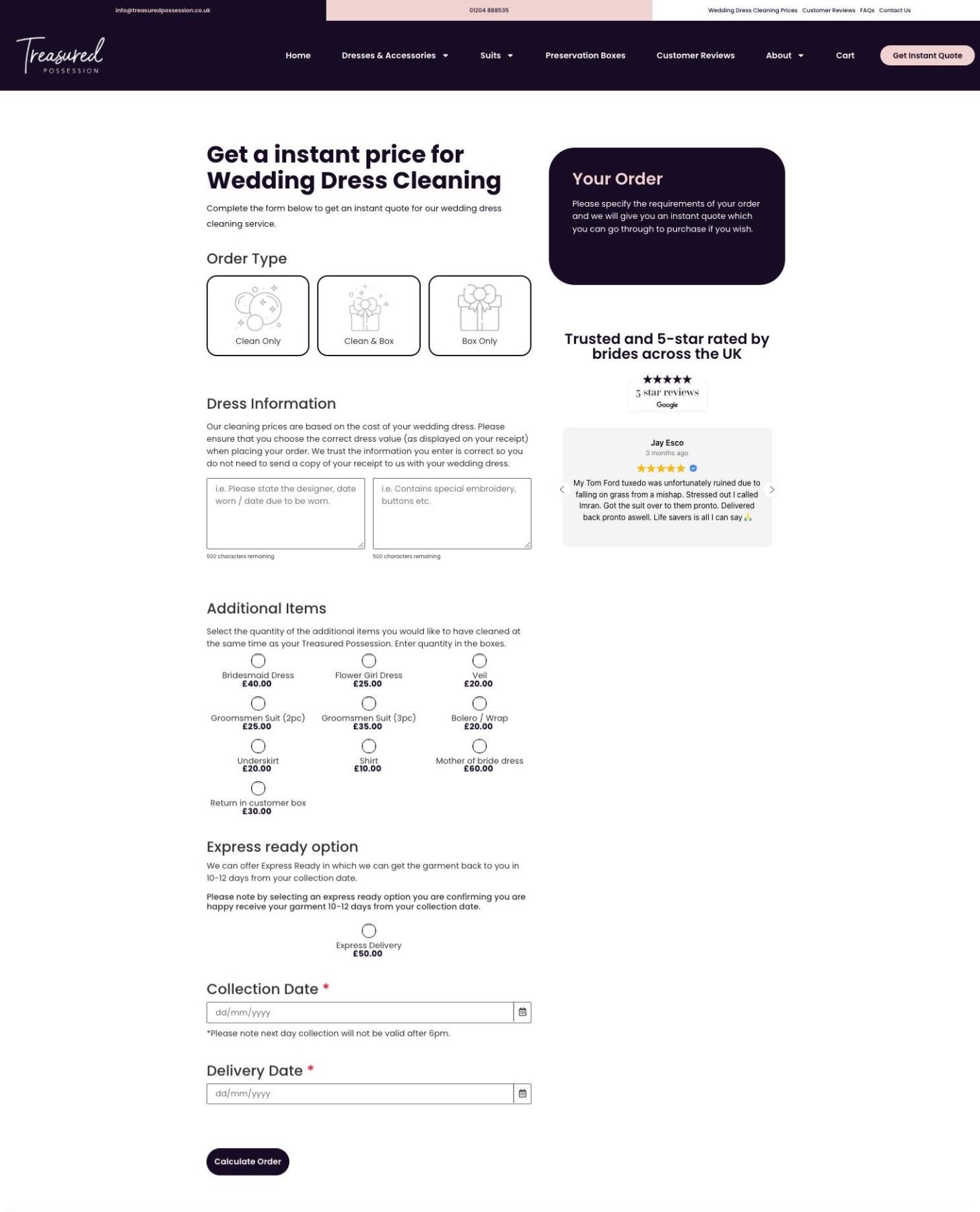
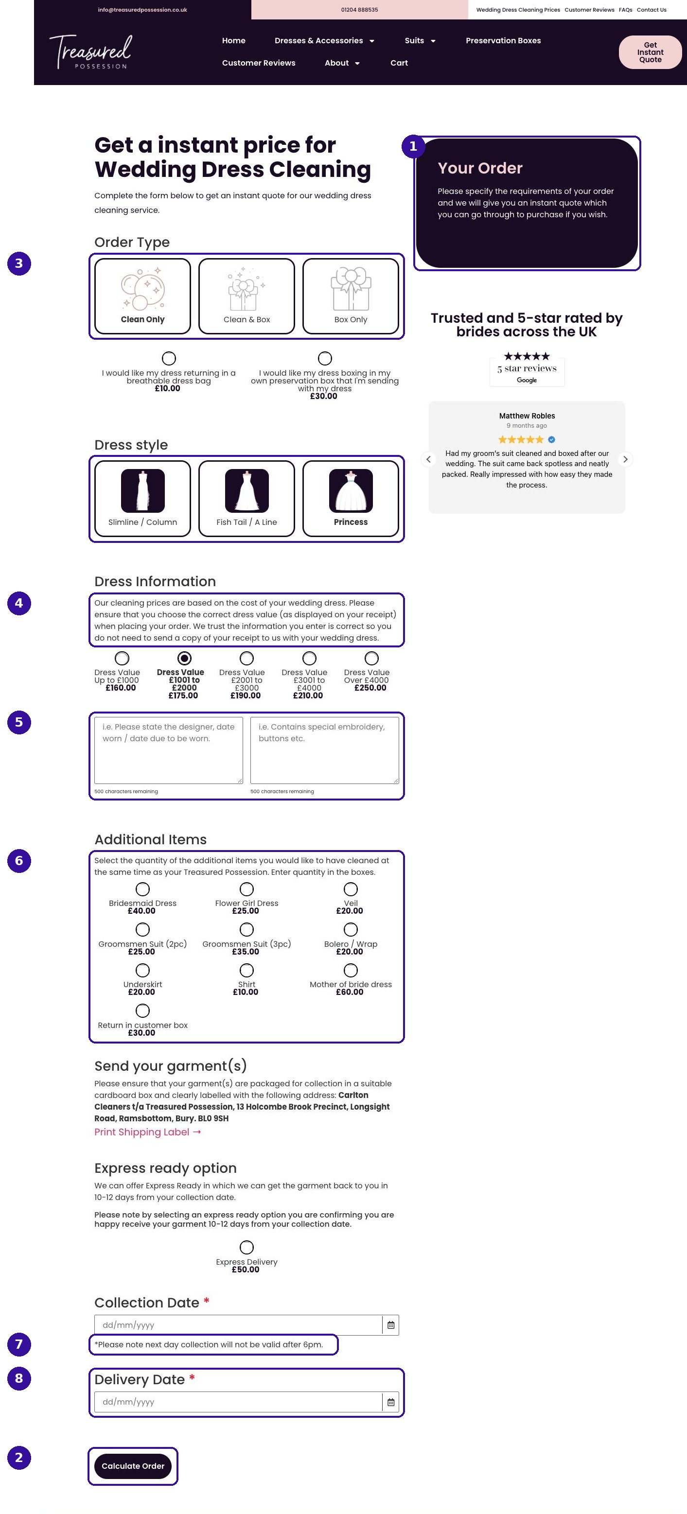
The form was confusing, and customers only saw a price once they reached the basket.
The "Calculate Order" button was WooCommerce's add-to-basket button with a different label. The form was already calculating the price as options were chosen, but the theme hid it. The business had no contact details for anyone who left before the basket, so it couldn't follow up.
Research
The price was hidden, some questions could be answered from order data, and competitors show a price within two clicks.
With a small budget, I chose methods that each answered a specific question: an audit of the live form, a year of order data and a benchmark of three competitors, backed up by customer reviews and a quick usability test with colleagues.
The Insight
The findings led to three principles: show the price early, ask fewer questions, and give customers a reason to share their email.
The New Flow
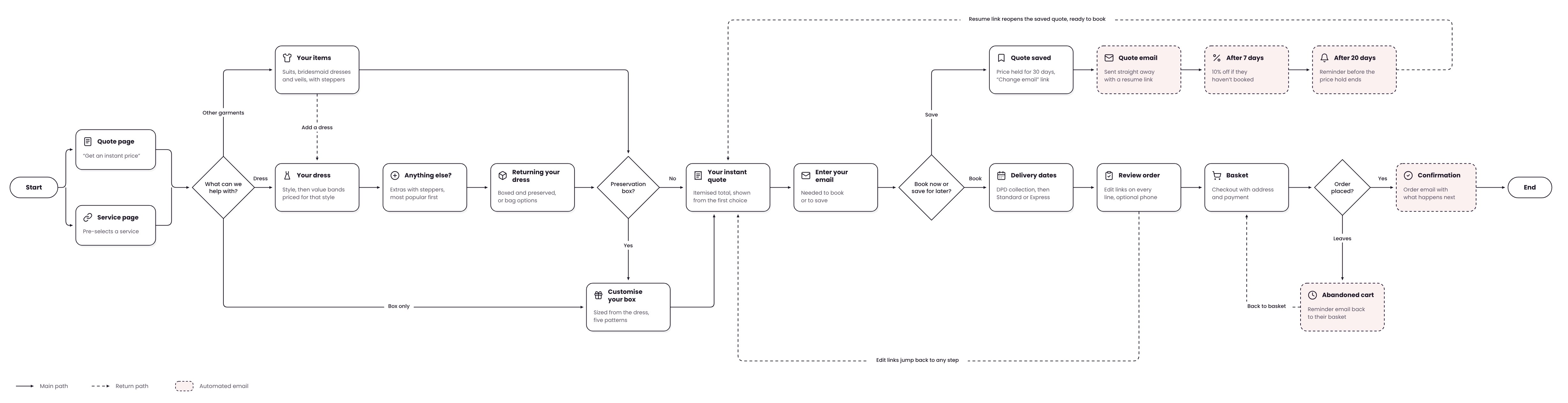
The first question decides which steps each customer sees, and the quote is shown before any dates are asked for.
The old form only worked for wedding dresses. To get a groom's suit cleaned, a customer had to order a wedding dress clean first and add the suit as an extra. I saw this as a possible bottleneck. The client said they rarely get those orders, but that could be because the form doesn't allow them.
We agreed to add the option and use the order data after launch to see whether it's worth pursuing. The new form starts with "What service?": clean a wedding dress, clean other garments, or just a preservation box. Customers see their price before being asked for dates, so the quote is useful even to people who aren't ready to book.
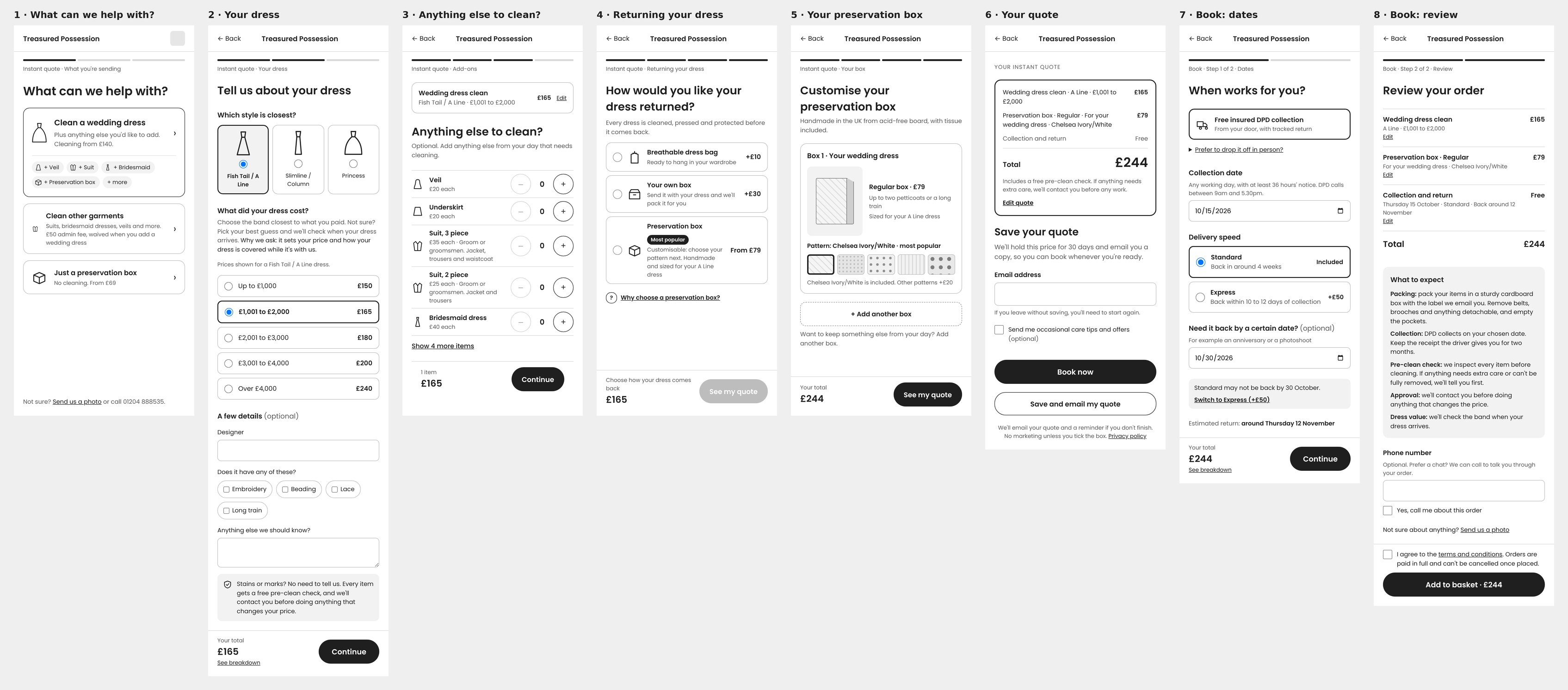
- 1What service?
- 2Dress details
- 3Additional items
- 4Box
- 5Quote details
- 6Book/Save Quote
- 7Delivery
Three ways in, one quote, then book now or save for later, with automated emails that bring customers back.
I built the wireframes into a clickable prototype with Claude Code. It fitted within the client's budget and meant every route could be tried, not just looked at.
Testing
I tested a working prototype with real prices. It showed three places where people hesitated, and the client agreed the changes.
I built the wireframes into a prototype that calculated real prices, then tested it with colleagues from outside the project, each working through a scenario on a phone or desktop.
Final Design
The tested flow in Treasured Possession's brand style, built as a working prototype for desktop and mobile.
I designed it in Figma using the brand's plum and blush, Poppins and a new set of fine line icons, then built it as a clickable prototype with real prices so the client and developer could try every route before build. It's designed to WCAG 2.2 AA, with keyboard-friendly cards, visible labels and price changes announced to screen readers.
What's Next
The form hasn't launched yet. Eight weeks after launch, these measures will be compared with the same period last year.
The new flow also opens up ideas the client wants to explore next: seasonal box designs, suit preservation as its own service, and preservation bought as a gift.