As Lead Web Designer at Asda, I owned the end-to-end creative specification process for digital display media — then identified the root cause of non-compliant submissions, and redesigned the entire information experience around them.
Brief
Redesign the supplier-facing guidelines for Asda's digital display media — replacing a PDF-based process with a structured interactive hub built around how suppliers actually work.
My Role
Lead Web Designer — responsible for defining the creative specifications, designing the banner templates from scratch, and redesigning the entire guidelines experience based on supplier research.
Problem Statement
UX Research · Problem Framing
The existing guidelines were PDF-based and structured around internal logic rather than how suppliers actually used them. Non-compliant submissions were common, and the account team was fielding the same questions repeatedly.
Background
Context · Ownership
As Lead Web Designer, I was responsible for the full creative specification process for Asda's digital display media — designing the banner templates and UI toolkit from scratch, defining technical requirements, and setting the WCAG accessibility standards suppliers had to meet. Owning the specs end-to-end meant I also had visibility of where they were breaking down.
Process & Approach
Information Architecture · UI Design · Build
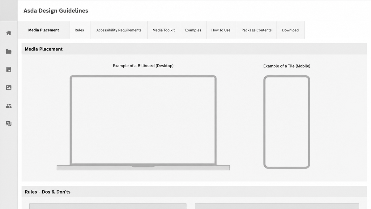
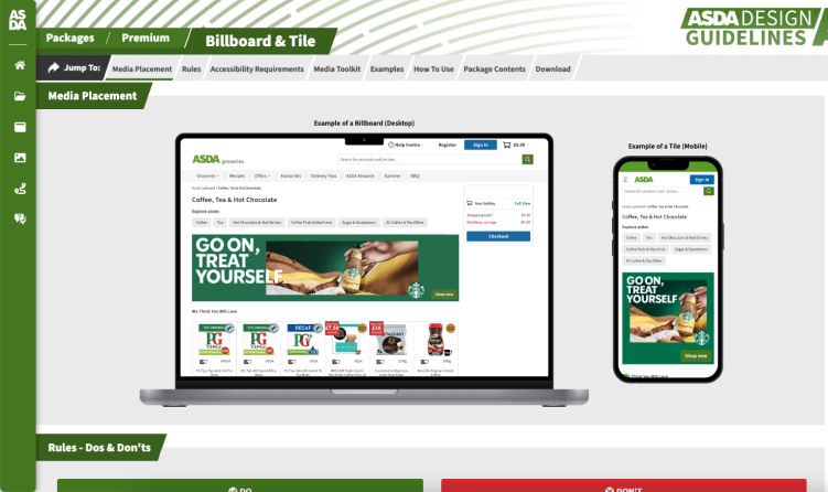
Rather than updating the PDFs, I rebuilt the guidelines as a bespoke interactive hub — structured around how suppliers browse and make decisions, not how the information had always been internally organised. Each media format got its own dedicated page with in-situ examples, accessibility guidance, downloadable templates, and direct links to the relevant Photoshop UI toolkit.
The hub was aligned to Asda's brand guidelines throughout. The architecture was later adapted for Asda's new CMS, maintaining the original structure while moving to standardised, modular components.
Usability Testing
Research · Synthesis · Iteration
Before launch I ran separate calls with five suppliers — a mix of regular submitters and those with a history of rejections. Each was given the same task: find the specs for a specific format, check the accessibility requirements, and download the correct template. I observed without steering, then mapped the feedback to find common patterns.
Five insights emerged, each pointing to a specific gap.
Insight 1 — Suppliers lost track of which package they were in
Asda's media offering was structured across five packages — Basic, Standard, Audience, Rich, and Premium. As participants moved between pages to compare formats, they lost track of which package they were browsing. Breadcrumb navigation was introduced so suppliers always knew where they were in the hierarchy and could step back without starting from scratch.
Insight 2 — In-page navigation wasn't obvious
Within each package page, suppliers were hunting for their specific format rather than reading top to bottom — but nothing signalled that the anchor links would jump them directly to it. Adding a "Jump to:" label made the function immediately clear and reduced the time spent scrolling in follow-up testing.
Suppliers couldn't internalise the accessibility requirements because the relationship between supplied dimensions and actual display size wasn't obvious. A banner delivered at 1000px wide might render at 400px on site — making text that looked fine at source potentially fail at the point of display. On top of that, Asda's UI dynamically overlaid elements like promotional roundels on banners, meaning content outside the safe zone would be obscured entirely. To make both constraints visible, I built the Artwork Checker Tool: it detects the template from the supplied dimensions and shows suppliers exactly how their artwork will appear on site — at the correct scale, with safe zone overlays applied.
Insight 4 — The Photoshop toolkit needed guided onboarding
Suppliers had the right file but no clear entry point into it. File structure, layer naming, and export settings weren't obvious without guidance. A step-by-step video tutorial was added to the toolkit section, walking through exactly how to use the file and export at the correct spec.
Insight 5 — Suppliers had no sense of progress through a long page
Each package page covered multiple formats across a significant amount of content. Suppliers working through it linearly had no indication of how far through they were or how much remained. A progress bar added to the top of the page gave them that reference point at a glance — and in follow-up testing, more suppliers reported reading to the end.
Results
Impact · Outcomes
The media implementation rate rose from 95% to 98%, and supplier questions to the account team dropped noticeably. At the volume Asda's campaigns team was working at, that shift in the rejection rate had a real operational impact.
The Artwork Checker outlasted the project it was built for. What started as a response to a single usability finding became a core part of Asda's internal media approval process — used to verify artwork before any banner went live. At peak periods that meant checking hundreds of banners a week.
95→98%Media implementation rate
↓↓Supplier questions & rejections
100sBanners checked per week via the Artwork Checker