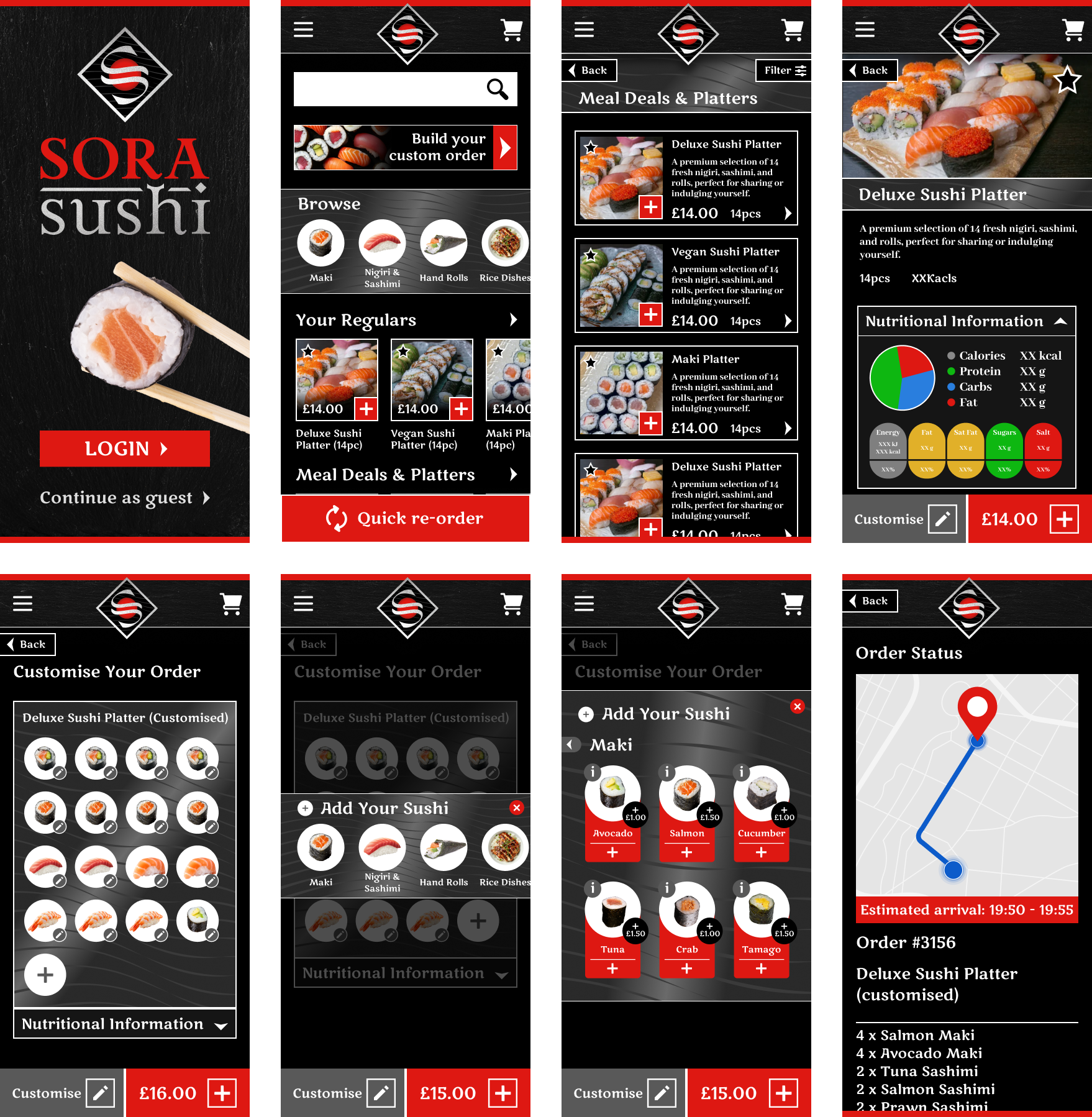
Branding · Identity
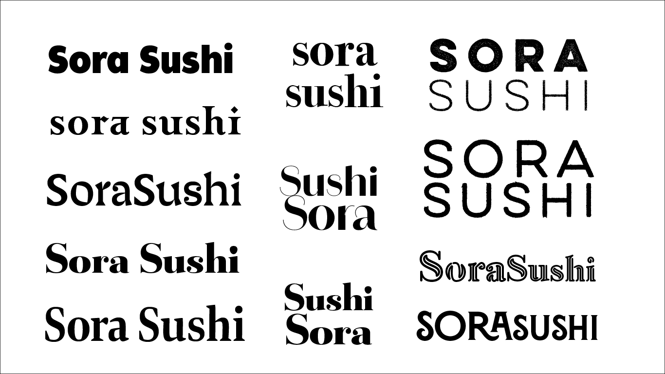
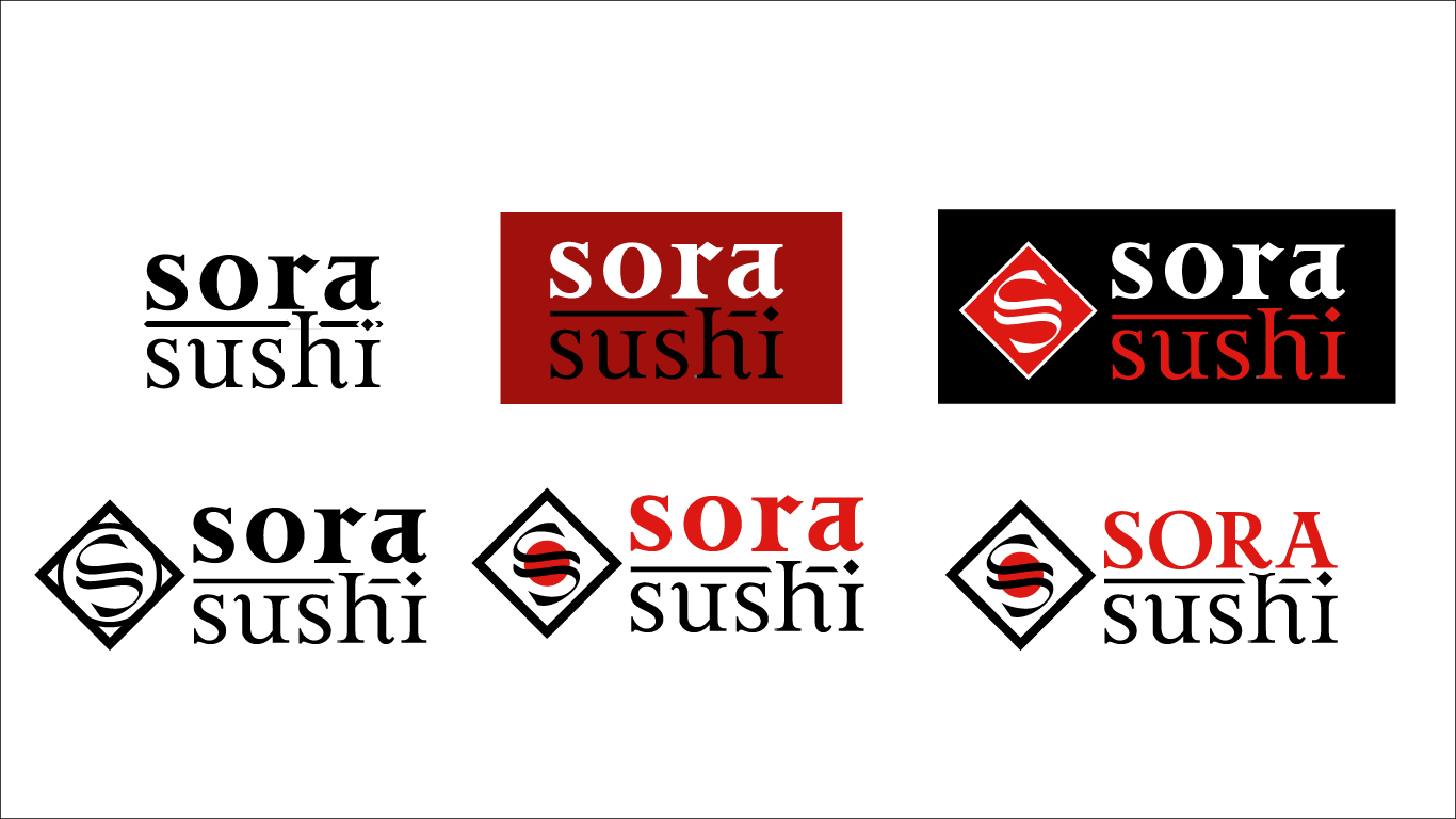
For Sora Sushi ("Sora" meaning sky in Japanese), I drew inspiration from Japanese culture, steel, and the national flag to craft a clean, modern brand. A minimalist palette of deep reds, whites, and metallic tones reflects Japan's elegance and simplicity, while the typography and logo balance strength, precision, and usability.
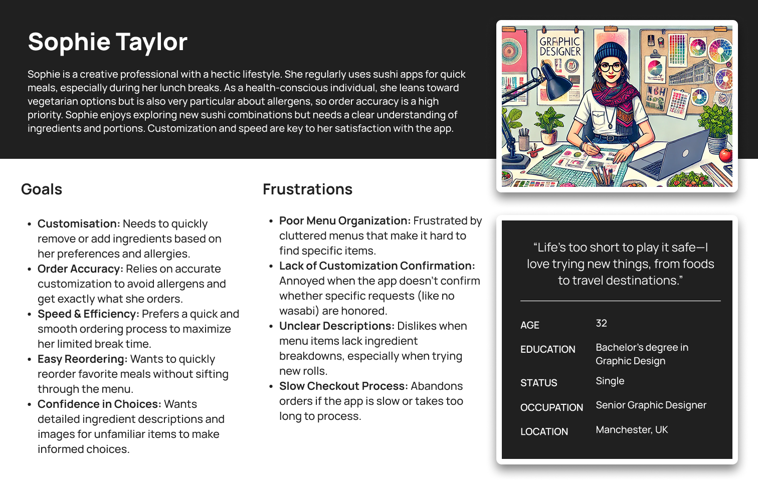
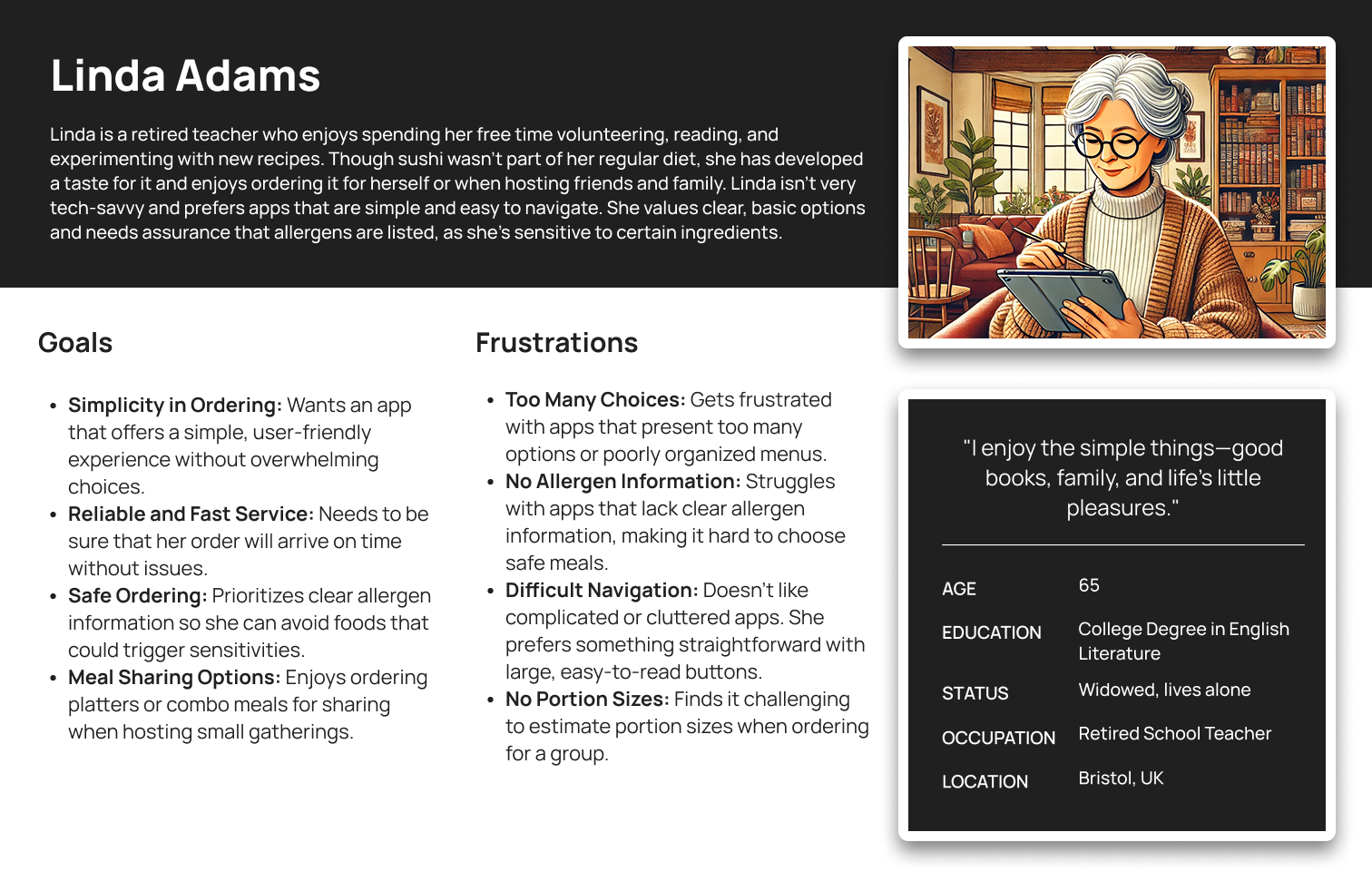
Research · Personas
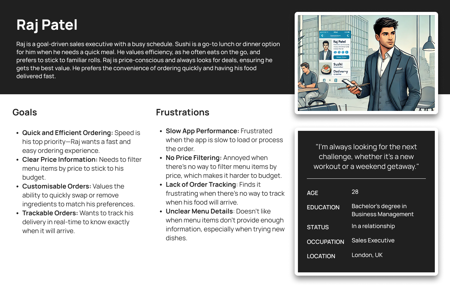
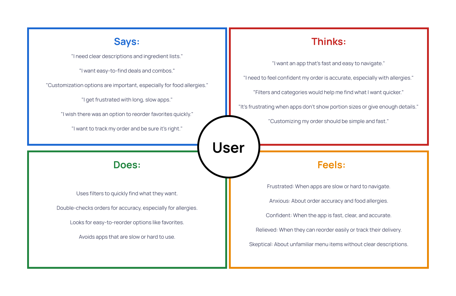
Through user research, I identified three key personas: Sophie, a designer with dietary restrictions needing quick customisation; Raj, a sales executive prioritising speed and price filtering; and Linda, a retired teacher who prefers a simple, user-friendly app. These personas guided the app's design to address their specific pain points — customisation, speed, and ease of navigation.
UX · Problem Discovery
The app must offer fast customisation, clear allergen info, and efficiency for users with dietary needs and busy schedules. It should enable quick ordering, real-time tracking, and group meal sharing while ensuring simplicity, accuracy, and a stress-free experience.
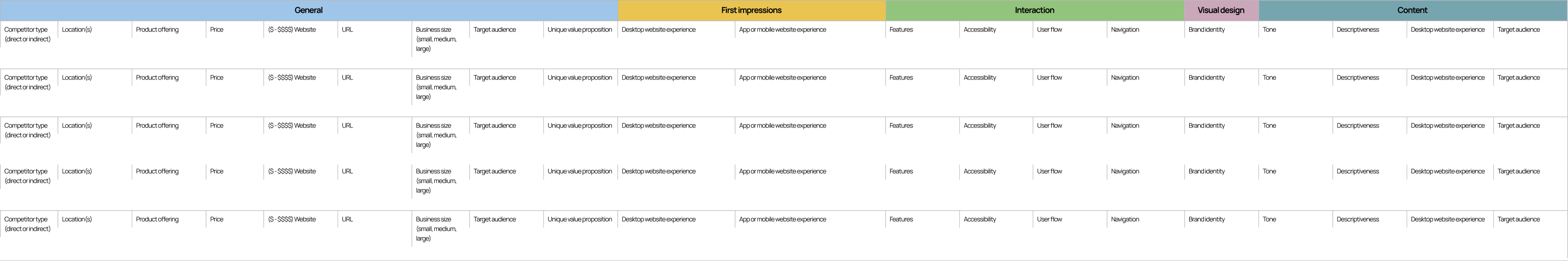
Research · Strategy
I conducted a competitor audit of direct and indirect sushi ordering platforms in the UK — evaluating UX, customisation options, pricing, and accessibility. By analysing Yo! Sushi, Sushi Kitchen, and Sushi Waka, I identified gaps: unclear allergen details, friction in checkout, and limited customisation. These insights directly informed Sora Sushi's design.
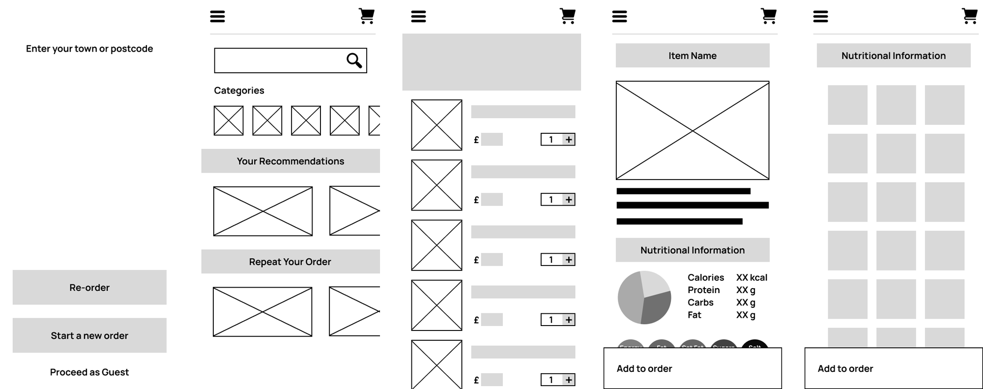
Figma · UX
Using Figma, I created low-fidelity wireframes to refine the layout and usability. After testing, I improved button placement, adjusted font sizes, and streamlined the checkout flow. The final design featured a Japanese-inspired aesthetic with smooth navigation, real-time tracking, and multiple payment options.