Full visual identity for a concept food brand — from discovery and ideation through to logo design, packaging, and brand application.
The Brief
Develop a complete brand identity for Masaco, a concept snack brand rooted in Mexican flavours and healthy ingredients. The brand needed to feel both modern and authentically cultural.
Deliverables
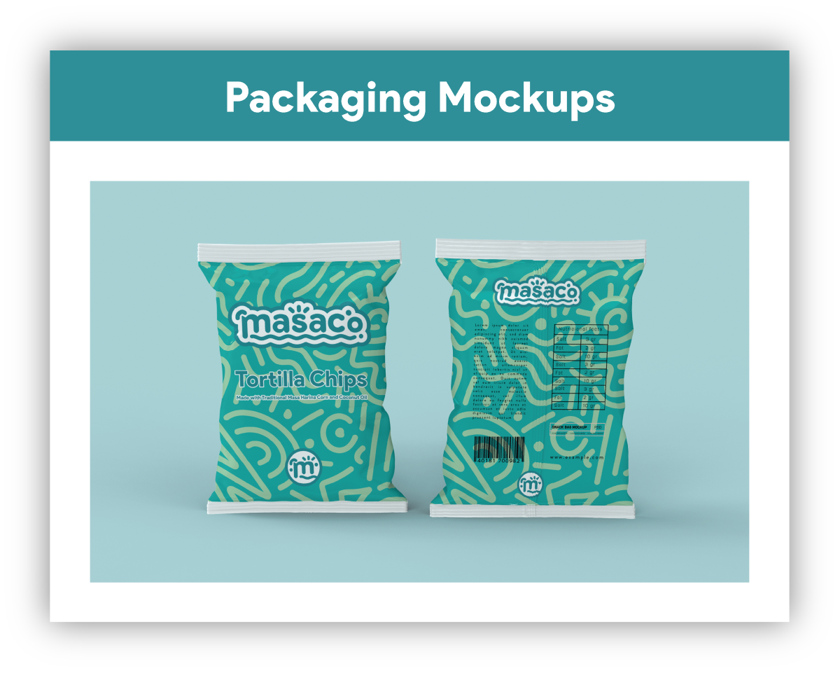
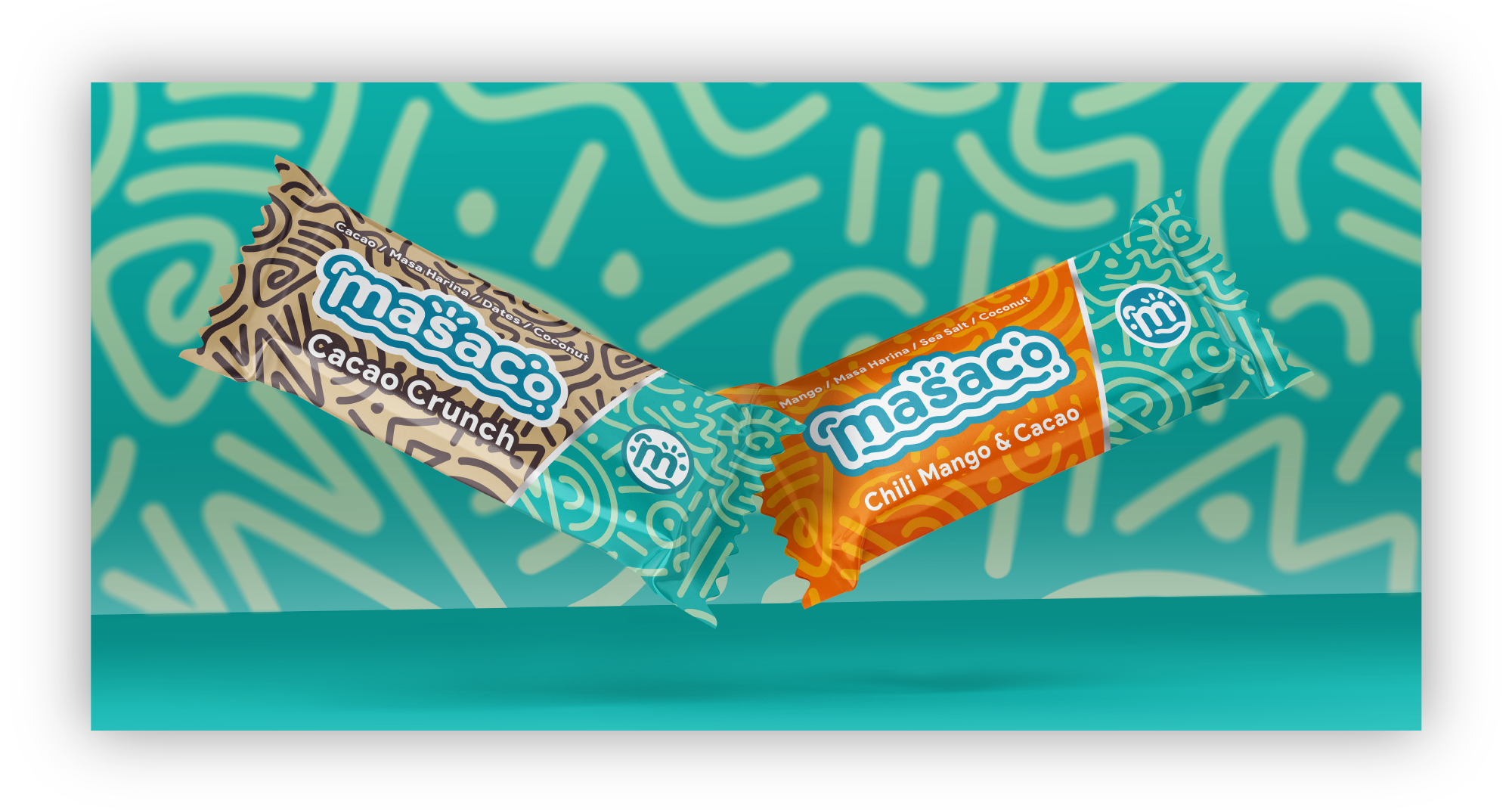
Brand strategy, moodboarding, typography exploration, logo design, pattern development, packaging mockups, and brand application guidelines.
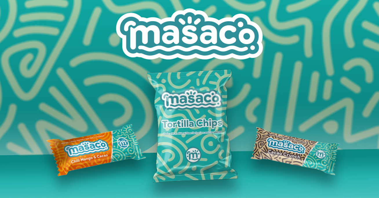
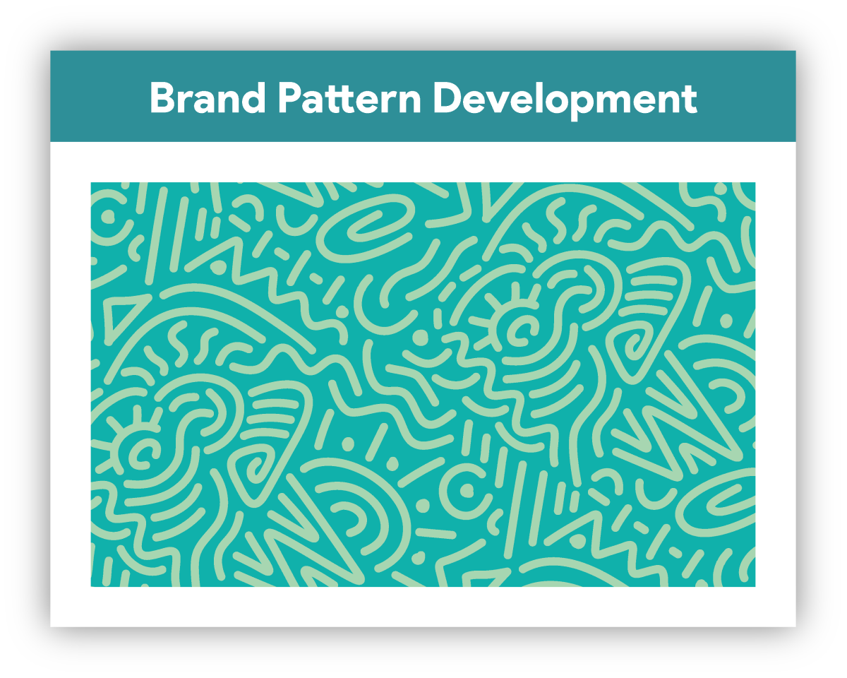
This project focused on building the Masaco visual identity — a concept for a food brand specialising in masa harina and coconut oil-based snacks. The branding was inspired by the sun, sea, and coconuts, with design elements rooted in tribal Mayan culture. The goal was to blend tradition with modernity: vibrant colours, bold typography, and packaging that reflects the brand's commitment to authenticity, quality, and healthy living.
Discovery & Research
Strategy · Research
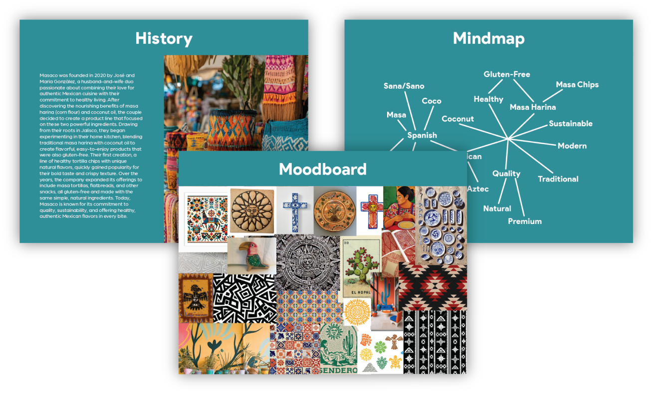
The discovery phase focused on understanding the brand's mission to deliver authentic, wholesome snacks with a modern twist. I created a moodboard of colours and textures that reflect the brand's vibrant yet grounded aesthetic — ensuring the visual identity felt both modern and rooted in tradition.
Brainstorming & Ideation
Typography · Exploration
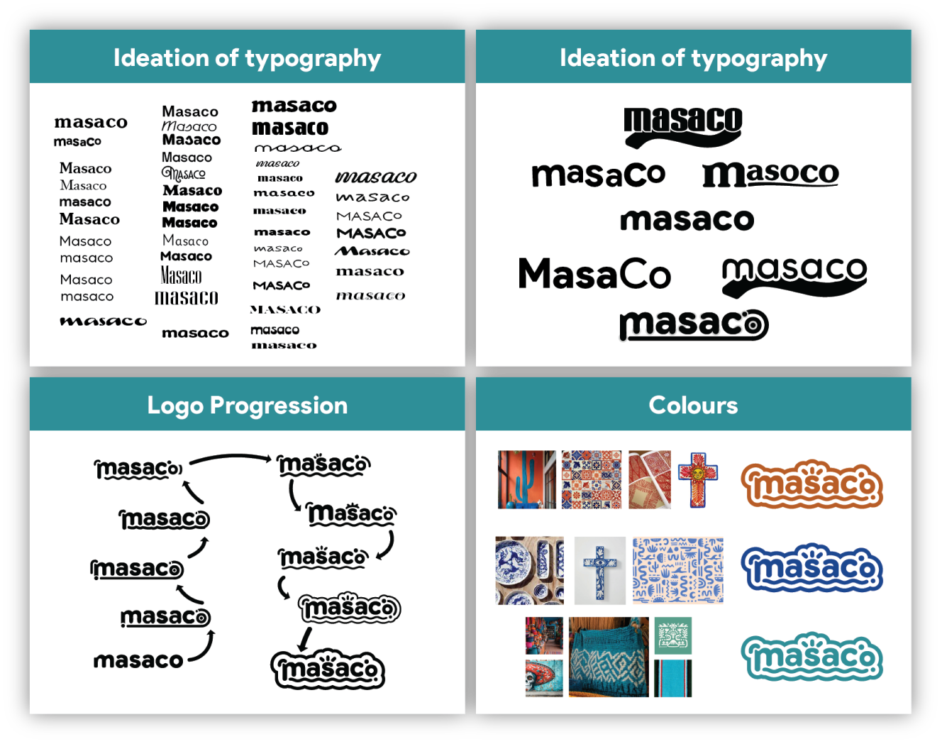
During the brainstorming phase, I explored a wide range of typography options for the Masaco name — experimenting with styles to find the right balance of boldness and readability. The logo progressed through several iterations, refining the design to combine modern simplicity with cultural roots.
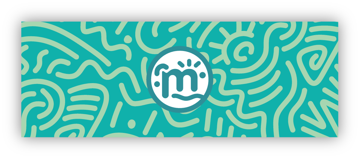
Logo Design & Development
Logo · Identity
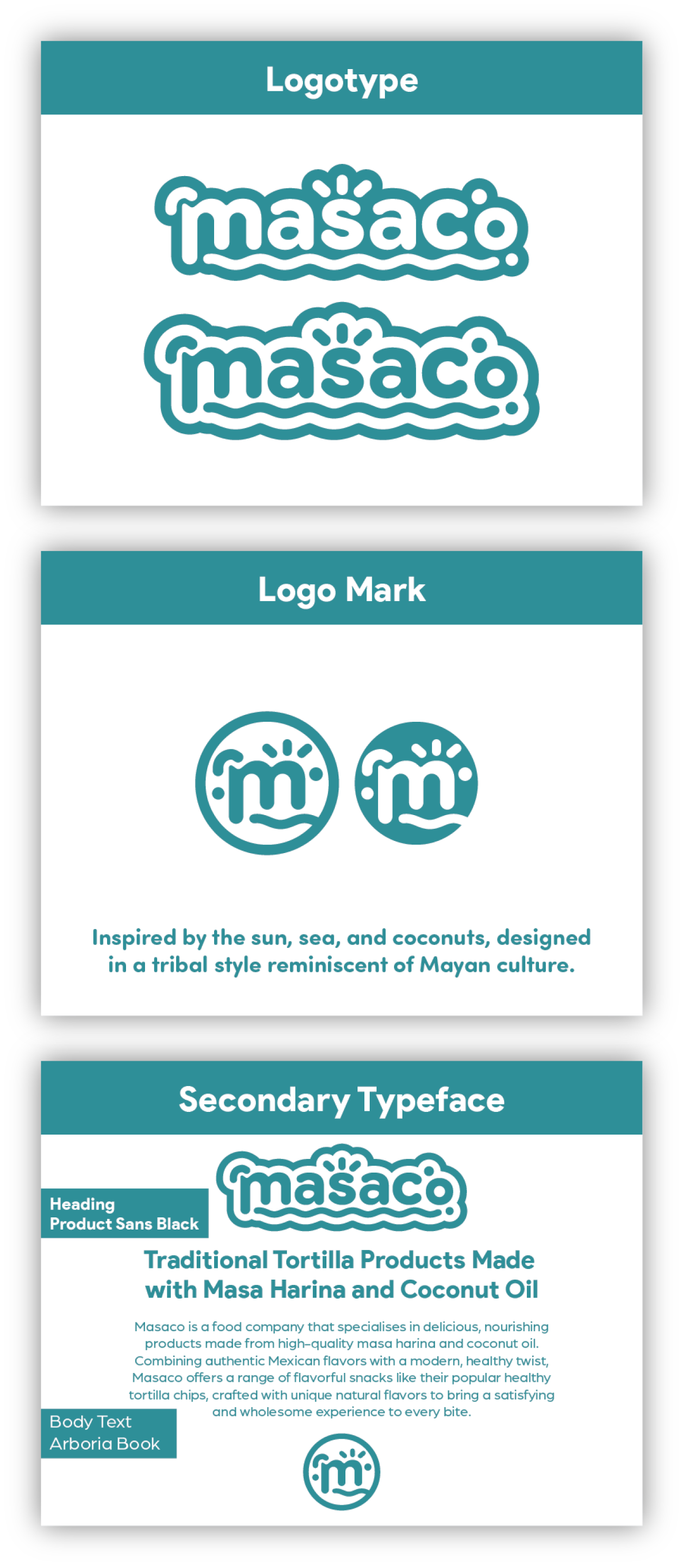
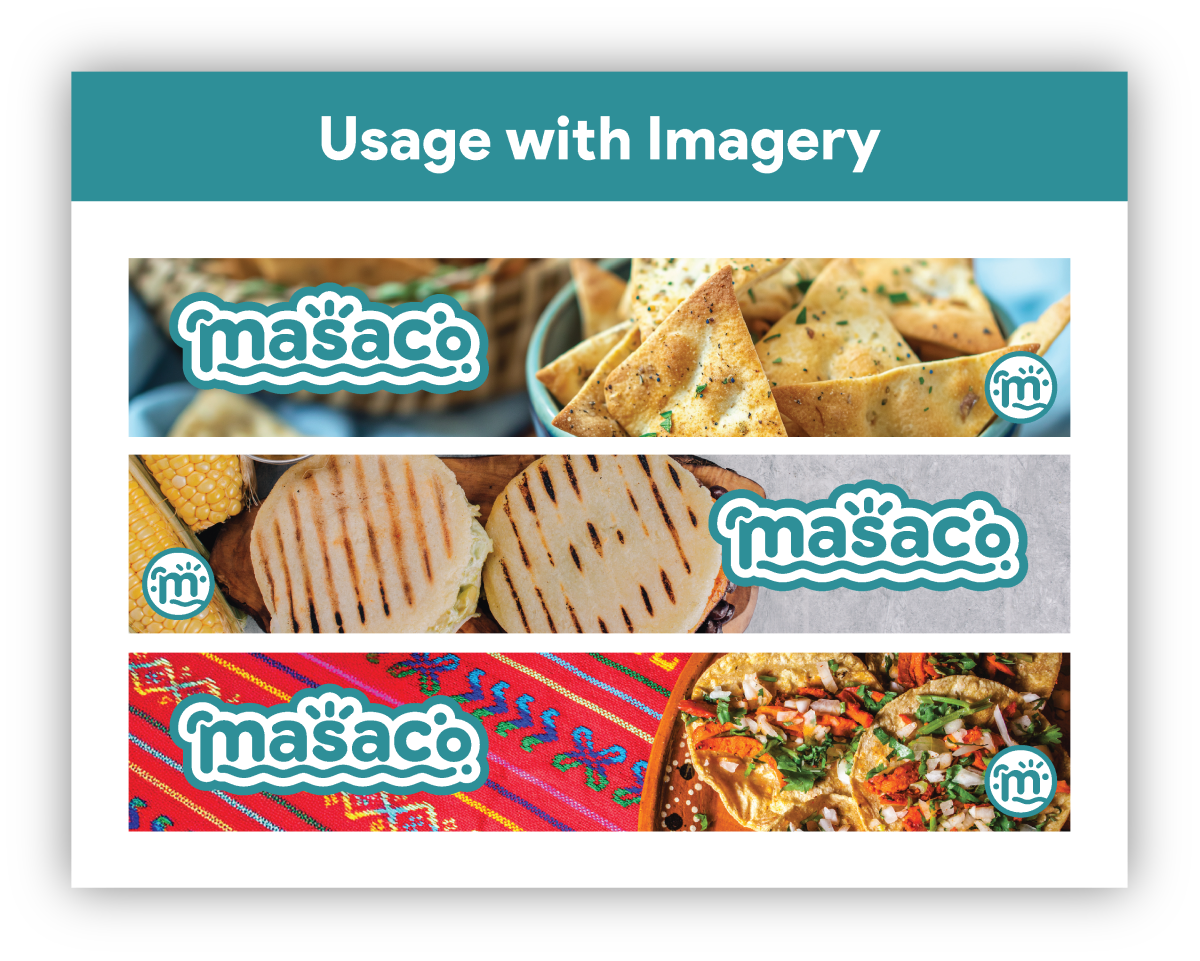
The Masaco logo started with a custom typography-based design that embodies the brand's bold yet authentic character. A logo mark was developed to complement the logotype — adding a symbolic element that strengthens the brand's identity. The type mark can be used independently for minimalistic applications like product packaging and labels.
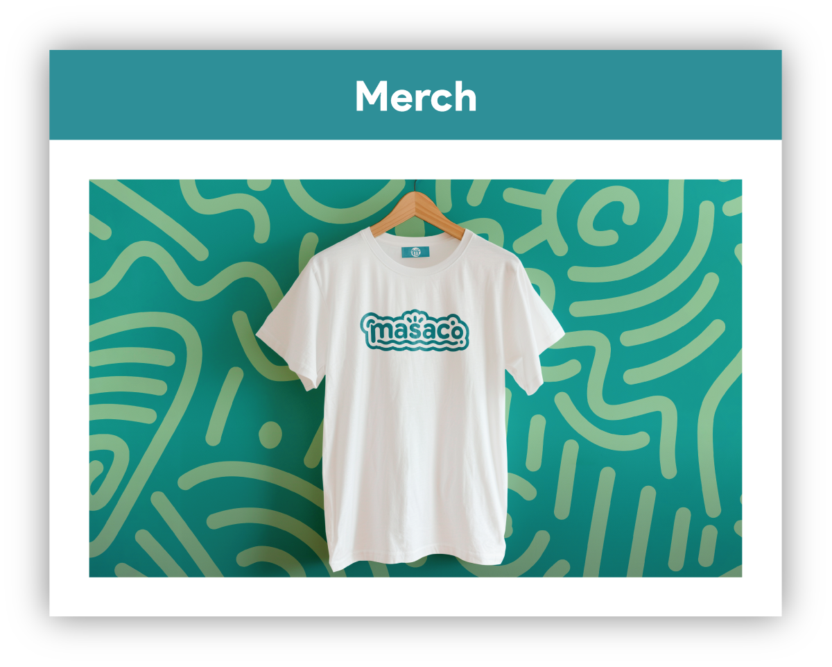
Usage & Applications
Brand Application · Packaging
This section shows the Masaco logo across various applications — from a custom Mayan-inspired pattern and logo variations, through to packaging mockups and merchandising that demonstrate how the identity translates to physical products.